Summary
The Summary section shows three widgets that provide quick analysis across all visible sources:
DB Engine Breakdown
Migration Complexity
Data Volume Per DB Engine
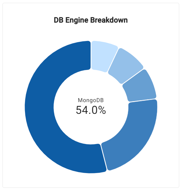
DB Engine Breakdown Widget
The DB Engine Breakdown widget shows the number of sources for each DB engine type. This view helps to understand which DB engine type is the most prevalent relative to others.
The segment showing the DB engine with the most sources is the largest and darkest shaded. The remaining segments become progressively smaller and lighter in shade.
Hovering over a donut segment shows a tooltip containing the DB engine name, percentage, and count of sources this segment accounts for.
The center of the chart shows the name of the DB engine with the most sources and the percentage that the engine represents of the whole.
Migration Complexity Breakdown Widget
The Migration Complexity Breakdown widget shows the percentage of sources that are in the low, medium, or high complexity level. This view helps to understand which complexity level is projected for most of the sources relative to other levels.
The size of each segment corresponds to the number of sources of the complexity level given the selected DB engine type and target. The shading of the segments is fixed—low being the lightest and high being the darkest.
The legend below the pie chart shows the percentages of each complexity level.
Hovering over a pie slice shows a tooltip containing the level, percentage, and count of sources this complexity level accounts for.
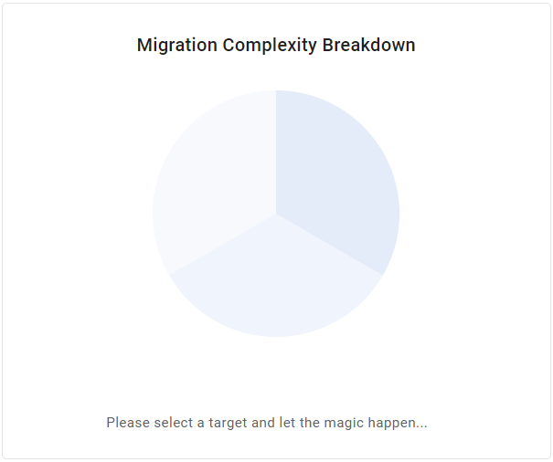
The Migration Complexity Breakdown widget is only active when a target is selected.
Data Volume Per DB Engine Widget
The Data Volume Per DB Engine widget shows a breakdown of the data volume by source DB engine. This view helps to understand which DB engine type holds most of the data relative to others.
Each bar represents the cumulative data volume of all shown sources of the given DB engine type. The number is shown as a percentage of the volume across all DB engine types of the currently shown sources.
Bars are sorted from lowest to highest volume percentage. Bars are shaded lightest for the lowest volume and go progressively darker for larger data volume.
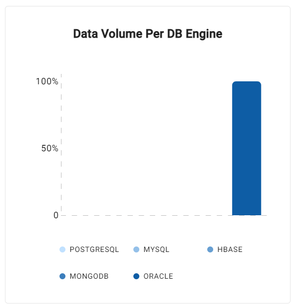
Volume percentages are rounded, which may cause lower-volume engines to diminish next to higher ones.